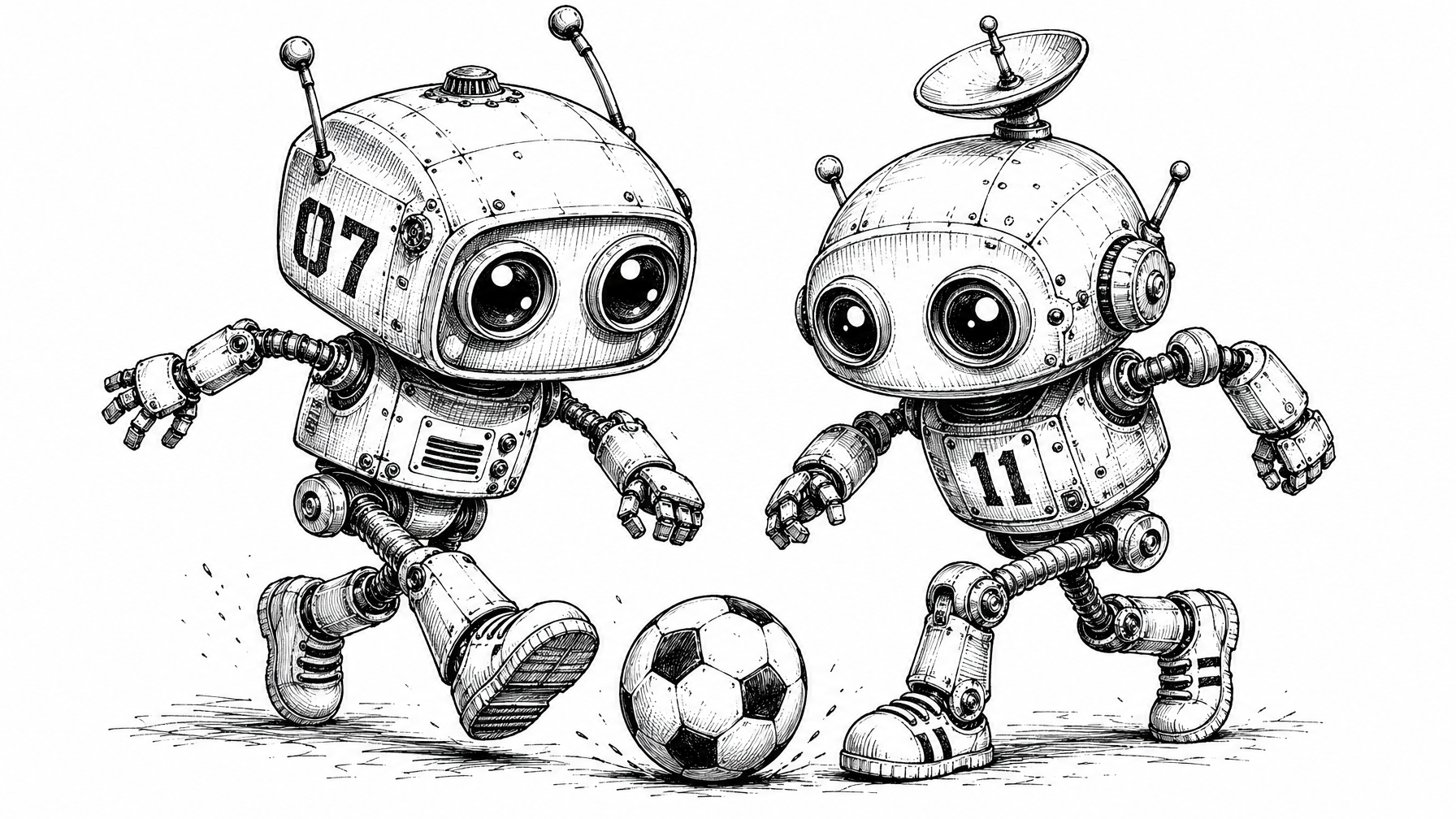
Two Robots Football Ink
by Bloominprompt example
EXAMPLE STYLE
# UNIFIED STYLE SPECIFICATION
Two robots playing football
## STYLE

Black-and-white pen-and-ink character concept illustration of whimsical robots, rendered in a retro-futuristic cartoon tradition that bridges editorial illustration, indie game concept art, and animated short character design. The style occupies a space between technical concept sketch and expressive cartoon drawing — mechanically credible but never engineering-precise, charming but never saccharine. The overall sensibility evokes lo-fi retro-tech nostalgia, spanning steampunk-adjacent to retro-digital aesthetics depending on the specific character, but always unified by hand-drawn ink craftsmanship on clean white ground. Each character functions as a standalone icon — a self-contained concept sheet entry or spot illustration suitable for editorial, book, web, or animation development contexts.

---

## COMPOSITION

Single character isolated on a clean white ground with no background environment. The robot is centered or positioned slightly off-center, occupying the middle vertical axis of the frame. Generous negative space surrounds the figure, reinforcing its function as an icon or concept sheet entry. The head is always the dominant mass, typically occupying the upper 50–60% of the composition and creating a pronounced top-heavy silhouette — chibi-style proportions with head-to-body ratios ranging from approximately 1.5:1 to 2:1 are standard for bipedal humanoid variants. The overall silhouette must be immediately distinctive and readable at small scale. Ground anchoring is minimal — a subtle shadow line, sparse hatching marks, or light ground-scratch texture at the base of the figure, never a full ground plane. Antennae, sensor stalks, or similar vertical extensions above the head create a characteristic silhouette crown. When the character holds a prop or extends limbs asymmetrically, this breaks the silhouette to create secondary focal interest and narrative gesture.

*Optional variant:* Horizontal compositions are permitted when a prop element (such as a cart or extended apparatus) creates a clear directional movement narrative. Multi-legged or non-humanoid body plans may produce wider, more symmetrical compositions with stable A-frame or splayed-leg stances. Environmental context beyond the ground line (such as a rail or track) is permissible as a minimal accent but must never develop into a full scene.
---
## TECHNIQUE
Fine-to-medium pen-and-ink line work with deliberate line weight variation. Heavier, bolder lines define the outer contour silhouette, establishing a strong readable edge. Medium-weight lines describe major internal divisions — panel seams, component boundaries, and structural articulation. Finer lines handle interior detail — surface marks, hatching, small hardware elements like bolts and rivets.
Cross-hatching is the primary shading method, applied with directional discipline: hatching strokes follow the curvature of the underlying form — curved on spheres and cylinders, straight on flat panels. Shadow concentration occurs consistently in predictable zones: under head overhangs, inside joint recesses, at the neck junction, and on surfaces facing away from an implied upper-left light source. Hatching density controls the full tonal range, from sparse single-direction lines for light mid-tones to layered cross-hatching for deeper shadows. Open white paper is left for the brightest highlights and most directly lit surfaces.
Mechanical joints — at shoulders, elbows, knees, ankles, neck — are articulated with small precise geometric forms: circles for pins and bolts, cylinders for segmented joints, concentric rings for sockets. These details convey functional plausibility without engineering accuracy. Eyes and optical elements use concentric circular strokes, often with a solid or near-solid black center and deliberate small highlight spots left in reserve.
Line quality retains hand-drawn character — slight irregularity, natural stroke variation, and organic imperfection. The drawing feels like skilled confident ink work by a human hand, not digitally generated vector paths.
*Optional variant:* Density ranges from lighter, more open rendering (sparse hatching, more white space, cleaner surfaces) to denser, grittier rendering (extensive cross-hatching across most surfaces, richer tonal development) depending on the character's intended personality — lighter for friendlier robots, denser for more industrial or utilitarian ones. Stipple marks, scattered ink spots, and small speckle textures may supplement hatching for surface quality. Spring-coil or cable elements use tight repeated curved strokes as a textural counterpoint to the structured body forms.
---
## MATERIAL
Surfaces read as lightweight-to-medium-weight metal — sheet metal, stamped steel, pressed tin, cast aluminum, or similar fabricated metal construction. This is communicated through visible panel seam lines, small bolts and rivets at construction joints, access panels, vent grilles, and mechanical fastener details distributed across body surfaces. The metal has a manufactured, assembled quality — these robots are built from components, not grown or sculpted.
Surface imperfections are present to varying degrees: small scratches, hairline cracks, minor dents, and surface marks suggest use and age. The degree of weathering ranges from light (a few incidental marks on otherwise clean surfaces) to moderate (accumulated wear, surface pitting, and grime-suggesting density), but the robots always read as functional rather than ruined. Even at their most worn, they are maintained machines, not wrecks.
Textural variety comes from contrasting material elements within each design: smooth optical lenses or screen displays against rough metal shells; exposed wires or cables introducing organic, loose-line chaos against structured body panels; rubber or segmented treads against rigid body shells; glass bulb elements against cast housings. These contrasts create visual interest and tactile believability.
*Optional variant:* Some robots may incorporate screen/display surfaces (CRT monitors, LED panels, pixel grids) that read as smooth, clean technology surfaces distinct from the surrounding metal. Tank treads, when present, receive dense segmented-block rendering. Sneaker-like or dome-shaped feet may introduce an unexpected organic softness at the base.
---
## COLOUR
Strictly monochromatic: pure black ink on pure white ground. No grey washes, no watercolour tints, no digital gradient fills, no halftone dot screens. The entire tonal range is achieved exclusively through ink line density — from completely open white paper (brightest highlights) through progressively denser hatching (mid-tones) to near-solid or solid black fills (deepest shadows and focal accents).
Solid black fills are used sparingly and with purpose — reserved primarily for eye pupils, deep optical recesses, and the darkest shadow pockets. This restraint ensures that solid black areas carry maximum visual impact when they appear. The overall tonal key varies by character but generally maintains a balance between open white breathing space and structured shadow development.
*Optional variant:* A single, highly restricted colour accent — specifically an amber/orange tone — may be introduced for one specific element only (such as an LED display or indicator light), creating a deliberate focal pop against the monochrome field. This accent must remain confined to a small area and must never spread to other robot elements or the background. Its use is exceptional, not standard.
---
## ENHANCEMENT
The eyes are always the primary focal point of any robot character, regardless of their number (one, two, or three) or type (concentric-ring optical lenses, simple solid-black dots, visor slits). They receive the highest contrast treatment — typically the densest black fills in the image — and the most careful rendering detail. Even when minimally rendered (two simple dots on a blank screen), the eyes command attention through their contrast against surrounding surfaces. The eye treatment is the single most important element for establishing robot personality and viewer connection.
Secondary focal enhancement is applied to the robot's most distinctive design feature — the element that defines its unique identity and narrative function. This may be a held prop (lightbulb, smartphone, megaphone), a defining body component (CRT monitor head, satellite dishes, film reel, tank treads), or a unique structural feature (multiple spider legs, shopping cart, LED display). This signature element receives extra rendering attention, unique textural treatment, or compositional emphasis (elevated position, radiating emphasis lines, size dominance).
Antennae with ball or shaped tips function as a recurring silhouette motif across the series, creating visual family cohesion. They extend the readable silhouette upward and add personality through their arrangement — symmetrical pairs, single offset stalks, or clustered arrays.
Mechanical joint articulation at all connection points (neck, shoulders, elbows, wrists, hips, knees, ankles) receives consistent careful detail — visible bolts, segmented cylinders, pin joints — reinforcing the constructed, assembled nature of the robots and providing secondary areas of visual interest for close inspection.
---
## EXCLUSIONS
**No colour** — with the sole exception of an optional single amber/orange LED accent as described above, all rendering must be pure black and white. No grey washes, no watercolour, no digital colour fills, no tinted inks.
**No digital shading techniques** — no smooth gradient fills, no airbrush effects, no soft drop shadows, no Gaussian blurs, no digitally generated tonal transitions. All tonal work must be achieved through visible ink marks (hatching, cross-hatching, stipple).
**No halftone dots or screen tones** — the Ben-Day dot patterns associated with commercial printing or manga tone sheets are excluded. Tonal variation comes from hand-drawn line density only.
**No background environments** — no rooms, landscapes, skies, floors with perspective, or contextual scenery. The character exists on clean white negative space with only minimal ground-line anchoring.
**No smooth vector-clean lines** — the line quality must never feel computer-generated, bezier-perfect, or mechanically uniform. Organic hand-drawn irregularity is essential to the style's character.
**No manga or anime style conventions** — no manga-style speed lines, emotion symbols, sweat drops, or characteristic manga eye construction. No anime hair, face proportions, or body language conventions.
**No photorealistic rendering** — the style is illustrative and stylised, never attempting trompe-l'oeil realism in lighting, material rendering, or anatomical proportion.
**No realistic human proportions** — robot body plans are deliberately exaggerated, stylised, and non-human in their proportional relationships, particularly the oversized head convention.
**No heavy solid black shadow masses** — large areas of flat solid black (spot blacks) filling significant portions of the image are excluded. Black fills remain small and targeted (pupils, deep recesses). Shadow is built through line accumulation, not flood fill.
**No technical blueprint or engineering drawing aesthetic** — despite mechanical credibility, the style remains on the illustration/cartoon side, never crossing into drafting conventions (dimension lines, callouts, orthographic projection, section views).
**No gradient fills of any kind** — whether digital or implied through smooth wash techniques. Tonal transitions are always built from discrete, visible marks.
Purchase or create a prompt style.
We've curated reference styles to subscribe to or you can create your own.
Paste your prompts into whichever image model you're using.
We recommend ChatGPT-5 — it's the best for image prompts.
Add your subject matter.
Use the placeholder at the top of the prompt to describe whatever scene, character, or vibe you want.
Be blown away by the results.
Try this prompt.
Test it out below.
UNIFIED STYLE SPECIFICATION
[(put subject matter in here)]
## STYLE Black-and-white pen-and-ink character concept illustration of whimsical robots, rendered in a retro-futuristic cartoon tradition that bridges editorial illustration, indie game concept art, and animated short character design. The style occupies a space between technical concept sketch and expressive cartoon drawing — mechanically credible but never engineering-precise, charming but never saccharine. The overall sensibility evokes lo-fi retro-tech nostalgia, spanning steampunk-adjacent to retro-digital aesthetics depending on the specific character, but always unified by hand-drawn ink craftsmanship on clean white ground. Each character functions as a standalone icon — a self-contained concept sheet entry or spot illustration suitable for editorial, book, web, or animation development contexts. --- ## COMPOSITION Single character isolated on a clean white ground with no background environment. The robot is centered or positioned slightly off-center, occupying the middle vertical axis of the frame. Generous negative space surrounds the figure, reinforcing its function as an icon or concept sheet entry. The head is always the dominant mass, typically occupying the upper 50–60% of the composition and creating a pronounced top-heavy silhouette — chibi-style proportions with head-to-body ratios ranging from approximately 1.5:1 to 2:1 are standard for bipedal humanoid variants. The overall silhouette must be immediately distinctive and readable at small scale. Ground anchoring is minimal — a subtle shadow line, sparse hatching marks, or light ground-scratch texture at the base of the figure, never a full ground plane. Antennae, sensor stalks, or similar vertical extensions above the head create a characteristic silhouette crown. When the character holds a prop or extends limbs asymmetrically, this breaks the silhouette to create secondary focal interest and narrative gesture. *Optional variant:* Horizontal compositions are permitted when a prop element (such as a cart or extended apparatus) creates a clear directional movement narrative. Multi-legged or non-humanoid body plans may produce wider, more symmetrical compositions with stable A-frame or splayed-leg stances. Environmental context beyond the ground line (such as a rail or track) is